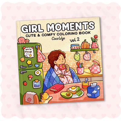
Girl Moments Vol. 2 Color Palette Inspiration
Table of Contents
Spring Color
Summer Color
Autumn Color
Winter Color
Download Girl Moments Vol. 2 Color Palette Sheet
You know that feeling when a page “clicks” the moment the colors match the mood?
Girl Moments Vol 2 loves those soft, everyday tones that feel lived-in and warm. A few colors kept becoming our quiet go-tos, soft enough to blend into any daily moment.
Spring Color
For the spring area, think fresh air and soft light. Lay down the light pastels first, then deepen a few spots to bring out the flowers and sky. Here are the colors for this spring area:
| Base & Main Color | Shading & Highlight Color | |
| #91EAF0 | #FFFA2E | #00A0C4 |
| #6ECCA7 | #FDC7DD | #187D62 |
| #E33772 | #6BB1E6 | #9E6FAC |
| #FE7688 | ||
Summer Color
Aim for soft sunshine and easy warmth for a casual summer feeling. Use light yellows as your base, blend gently into peach, then shade a few clouds. It keeps the scene bright and relaxed. Check out the summer shades for this part below:
| Base & Main Color | Shading & Highlight Color |
| #DDF479 | #D58200 |
| #A2E56A | #15603D |
| #FF9DCD | #9C4A11 |
| #FFFCC1 | #FFBF00 |
| #D44402 | #94FBCA |
| #D58200 |
Autumn Color
Fall here feels like the sky slowing down for the day. Use soft oranges and warm golds as your base, then deepen a few spots to bring out that cozy, end-of-day glow. And here are the colors that shape this fall sky:
| Base & Main Color | Shading & Highlight Color |
| #FFC081 | #FF9421 |
| #A64411 | #4C352E |
| #A2650A | #D75299 |
| #FFEC5B | #644194 |
| #E393D9 | #C15F00 |
Winter Color
And as the day slips into winter, everything feels a bit cooler and quieter. Keep your blues soft at first, then deepen a few spots to bring out that frosty air and drifting snow. The winter colors for this part are right below:
| Base & Main Color | Shading & Highlight Color |
| #A1FBFF | #57A8CB |
| #218BF2 | #19397B |
| #3060A4 | #2E353C |
| #96E7C9 | #45312B |
| #516D84 | |
| #75422C |
Girl Moments Vol. 2 Coloring Book (Spiral-bound) & Sticker Set

If you enjoy calm little moments and want something easy to color after a long day, Girl Moments Vol. 2 fits that mood so well. It’s made for anyone who loves cozy, everyday scenes and prefers pages that feel gentle and beginner-friendly, plus a sweet sticker set to play with.
What helps most during a slow coloring break is when the book simply stays open and out of the way. The top spiral keeps the page steady so your hand can move easily without fuss!
Coloring Tips
1. Test colors on a corner before touching the page
It’s common for beginners to choose colors from the cap, though the shade might shift on paper. Testing a small spot first keeps your palette consistent.
2. Work from light to medium before adding anything dark
Starting too dark makes shading harder to fix. Building up slowly keeps the page cleaner and gives you more control.
3. Rest your hand between layers
Markers blend better when the layer underneath is dry. A short pause helps the colors settle and reduces bleeding or muddy patches.
4. Avoid filling tiny details with thick marker tips
Using a broad tip on small areas causes bleeding and loses the detail of the drawing. Switch to a fine tip or color around the detail first, then fill it slowly for a cleaner finish.
FAQs
How to color Girl Moments scenes if I’m not sure where to start?
Begin with light tones to set the mood, then slowly build darker shades where the scene naturally turns inward. There’s no strict formula, choose colors that feel gentle to you and let the moment guide the rest.
What tools can help me capture colors from a video?
Pause the video, take a screenshot, then use a trusted color-picker to sample the shades. Many people use built-in pickers on design apps or well-known tools like Adobe Color, Coolors or the basic eyedropper in photo editors. Any option works if it helps you capture the tones you like.
How do I choose colors to show all four seasons on one Girl Moments page?
Pick one main mood for each section warm golds for summer, soft pastels for spring, cool blues for winter and muted browns for fall. Keep the transitions gentle so the seasons blend softly instead of feeling divided.
How do I pick a palette that feels soft but still has enough contrast?
Start with a gentle base (like warm creams or light pastels), then add 1–2 deeper tones to anchor the scene. Soft pages shine when there’s a quiet balance between light and shadow, not when everything is equally bright.
What’s a simple approach to balancing warm and cool tones across four seasons?
Place warm tones opposite cool tones to keep the layout visually even. Repeating a few neutral shades helps connect all four sections.
What is the 70 20 10 rule for colors?
It breaks down your color distribution like this: 70% dominant color, 20% secondary color, and 10% accent color. The goal is to create harmony while still allowing room for personality and contrast.


